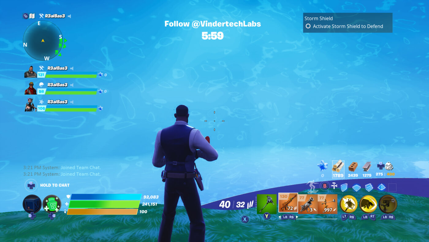
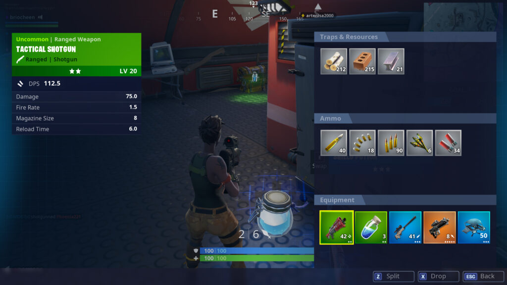
In the chaos of a fast-paced Fortnite engagement—especially during intense build fights or focused duels in Zero Build—split-second awareness of one’s own health and shield status is paramount. Historically, the health bar could be small or easily overlooked in the visual clutter of combat.
Epic Games has now addressed this crucial cognitive load issue by introducing a completely overhauled HUD, specifically focusing on making Health and Shield indicators impossible to miss, even in the most intense scenarios.
The Rework: Clarity Under Pressure
The update is a prime example of optimizing game design for competitive readability:
- Larger, Prominent Bars: The health and shield bars have been visually enlarged and repositioned slightly to be more prominent on the screen. This ensures they catch the player’s eye without obstructing the main field of view.
- Enhanced Visual Feedback: The animations for taking damage and initiating healing have been significantly refined. When damage is taken, the visual “flash” is sharper and more defined. When healing, the bar fills with smoother, clearer animation, providing immediate, unambiguous feedback on the player’s current status.
- Distinct Color Coding: The color coding for health (green) and shield (blue/purple) is now more vibrant and distinct, making it easier to instantly differentiate between the two resources at a quick glance.
The overall goal is to reduce the mental processing time required to assess combat status, allowing players to dedicate more attention to aiming and tactical movement.
Competitive and Tactical Benefits
This UI improvement has immediate, positive consequences for gameplay efficiency:
- Faster Decision-Making: Players can now instantly determine if they need to prioritize healing, disengage, or push their advantage. For instance, clearly seeing that an opponent’s shot broke only the blue shield and didn’t touch the white health allows for a more confident counter-push.
- Inventory Management: The clarity extends to item usage. Players can confirm whether a Mini Shield Potion is necessary or if a full Medkit is required with minimal delay, improving the efficiency of resource consumption during lulls in combat.
- Reduced Visual Clutter: While the bars are larger, the design is cleaner, reducing unnecessary visual noise that could interfere with tracking opponents or utility effects on the screen.
This interface overhaul is a massive quality-of-life victory, ensuring that the critical information required for survival and winning engagements is presented clearly and efficiently.


